Introduction
Organizations pour resources into employee experience programs — engagement initiatives, DEI commitments, wellness benefits — and then struggle to answer a basic question: is any of it working?
Most organizations have the effort. What they lack is visibility. Data about how employees actually feel sits scattered across disconnected HRIS platforms, quarterly surveys that take weeks to analyze, and spreadsheets that are outdated the moment someone opens them. By the time a pattern surfaces, it's already become a crisis.
This guide covers what employee experience insights dashboards are, which metrics belong on them, how to build one that drives real decisions, and why the quality of data feeding the dashboard matters as much as the dashboard itself.
Key Takeaways
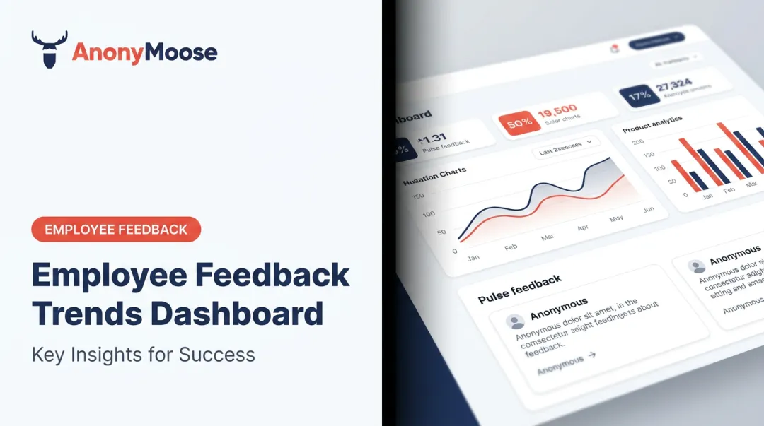
- An EX insights dashboard consolidates workforce sentiment, engagement, and performance data into a single, real-time view for HR leaders and executives
- Core metrics span three categories: sentiment (eNPS, ESAT), behavioral (absenteeism, voluntary turnover), and DEI indicators
- When employees fear retaliation, they self-censor — and your dashboard reflects polished fiction, not reality. The SHRM Study (2020) found that 82% of employees are more likely to share critical feedback when their anonymity is preserved, and buildempire.co.uk research shows anonymous surveys generate 58% more honest feedback — meaning the quality of data feeding any EX dashboard depends directly on whether the underlying feedback channels earn that level of trust
- Effective dashboards require clear goals, consolidated data sources, and a consistent review-and-act cadence
What Is an Employee Experience Insights Dashboard?
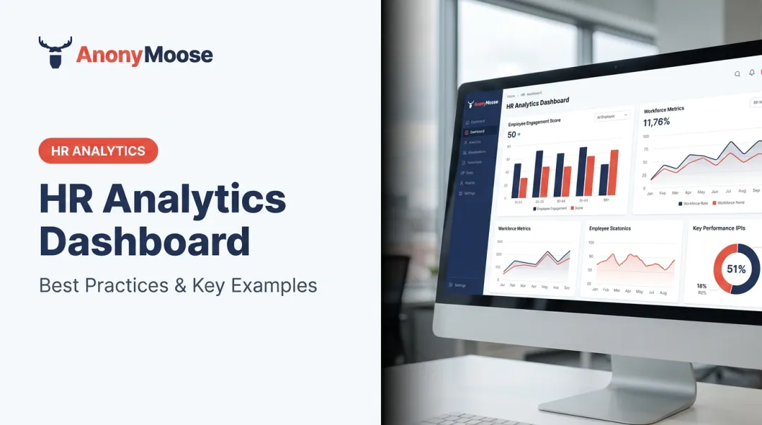
An employee experience insights dashboard is a data visualization platform that aggregates workforce KPIs, survey results, and EX metrics — eNPS, satisfaction scores, absenteeism, voluntary turnover — into a single, real-time interface accessible to HR leaders, managers, and executives.
That scope differs meaningfully from a standard HR dashboard.
HR dashboards vs. EX dashboards:
| HR Dashboard | EX Insights Dashboard |
|---|---|
| Headcount and payroll | Employee sentiment and morale |
| Compliance tracking | Belonging and psychological safety |
| Benefits enrollment | Engagement trends over time |
| Operational workforce data | Cultural health indicators |
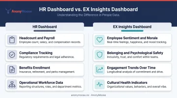
An HR dashboard tells you who is in your organization and what they cost. An EX insights dashboard tells you how those people are experiencing their workplace — and whether that experience is improving or deteriorating.
The core value: EX dashboards replace fragmented data and delayed reporting with a live, unified view. That shift moves HR teams from reactive problem-solving (responding to resignation waves after they happen) to proactive workforce management that spots early warning signs before they compound.
Why EX Dashboards Matter: The Business Case
The financial argument is blunt. According to SHRM, replacing an employee can cost between 50% and 200% of their annual salary, depending on role level. For a mid-level manager earning $80,000, that's a potential $160,000 replacement cost per departure.
Multiply that across even modest turnover numbers and continuous EX monitoring stops being optional.
The broader picture is just as stark. Gallup's 2026 State of the Global Workplace report found that only 20% of employees worldwide were engaged in 2025, with lost productivity costing the global economy an estimated $10 trillion — roughly 9% of global GDP.
These aren't abstract numbers. They represent real output lost from disengaged people who show up but don't contribute.
What Dashboards Enable That Gut Feel Can't
EX dashboards replace the guesswork that passes for workforce management in many organizations. With continuous metric monitoring, HR and leadership can:
- Tie culture investments to measurable outcomes — does a management training program actually improve team satisfaction scores?
- Spot department-level warning signs early — rising absenteeism in one division often predates a wave of departures by 60–90 days
- Build the evidence base for workforce planning — retention risk becomes a data conversation, not a hunch
The compounding benefit is timing. Organizations monitoring EX metrics continuously surface problems while there's still room to act. Those relying on annual surveys tend to learn what went wrong from people who've already decided to leave.
Essential Metrics for Your EX Insights Dashboard
Effective dashboards don't track everything — they track the right things. The most useful framework spans three categories: sentiment (how employees feel), behavior (what they do), and outcomes (what results).
Employee Sentiment Metrics
Employee Net Promoter Score (eNPS) is the fastest headline measure of workforce loyalty. SurveyMonkey's eNPS benchmark guidance outlines the calculation clearly:
- Employees rate the question "How likely are you to recommend this company as a great place to work?" on a 0–10 scale
- Promoters score 9–10, Passives score 7–8, Detractors score 0–6
- Formula: % Promoters − % Detractors
Score benchmarks from SurveyMonkey: above 50 is excellent, 10–30 is average, below 0 needs attention. Industry context matters — technology sector averages around 28, healthcare around 15.
Employee Satisfaction Score (ESAT) complements eNPS by measuring daily satisfaction depth rather than overall loyalty. AIHR describes a common 5-point format with bands ranging from dissatisfied (1.51–2.50) through to very satisfied (4.01–5.00).
Where eNPS captures advocacy, ESAT captures how employees feel about their day-to-day work experience. Together, they give a more complete picture than either metric alone.
Behavioral and Outcome Metrics
Absenteeism rate is calculated as: absences ÷ total workdays × 100. It's frequently treated as a lagging operational metric, but unplanned absences are better understood as an early behavioral signal — often indicating burnout, disengagement, or management problems before they surface in surveys.
CIPD's 2025 Health and Wellbeing at Work report found average UK absence reached 9.4 days per employee per year, with mental ill health cited as a top-three cause of long-term absence by 41% of respondents. Tracking absenteeism alongside mental health indicators gives the metric its proper diagnostic power.
Voluntary turnover rate captures employees choosing to leave — which signals systemic cultural or management problems more directly than involuntary exits. Industry benchmarking matters here. BLS JOLTS data from March 2026 shows US voluntary quit rates varying from 1.1% in information to 3.1% in retail trade. There's no universal "healthy" threshold — benchmark against your sector, not a generic number.
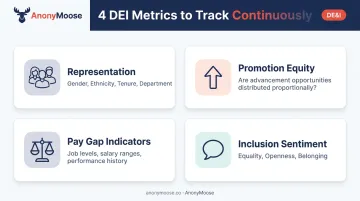
DEI and Inclusion Metrics
DEI metrics belong on an EX dashboard year-round, not just in annual compliance reports. Inclusion is a lived employee experience.
Metrics worth tracking in real time:
- Representation by gender, ethnicity, tenure, and department
- Promotion equity rates — are advancement opportunities distributed proportionally?
- Pay gap indicators — SHRM's pay equity guidance recommends tracking job levels, salary ranges, performance history, and promotion data together
- Inclusion sentiment scores — McKinsey identifies equality, openness, and belonging as three measurable inclusion dimensions
Surfacing this data continuously, rather than in annual snapshots, gives leadership the response time to course-correct before disparities become entrenched.
Types of Employee Experience Dashboards
Most organizations don't build one dashboard. They build for a specific purpose first, then expand. The four most common types:
| Dashboard Type | Primary Metrics |
|---|---|
| Employee Engagement | eNPS, ESAT, morale trends, pulse survey results |
| DEI Dashboard | Representation, promotion equity, pay gap, inclusion sentiment |
| Performance & Development | Goal completion, training hours, skill progression |
| Workforce Health | Absenteeism, voluntary turnover, retention risk |
Pick the type that addresses your most urgent organizational question — then build from there.
Executive vs. Manager Views
Both views are necessary, though they serve fundamentally different purposes.
Executive-level dashboards show org-wide aggregate KPIs: overall engagement trend, company-wide eNPS, turnover rate by quarter. These inform strategic decisions about culture investments, hiring plans, and leadership development.
Manager-level dashboards go narrower: a team's satisfaction trend, a department's absenteeism rate, direct reports' pulse results. That specificity drives day-to-day management decisions rather than org-wide strategy.
Modern EX dashboards increasingly integrate qualitative data alongside quantitative scores. Sentiment analysis from open-ended survey responses gives context behind the numbers: a declining eNPS score is far more actionable when you can see what themes employees are raising in open text, not just that the number dropped.
How to Build an EX Dashboard That Drives Action
Step 1: Define Goals and Select Metrics
Start with the business question, not the metrics. "Why is turnover rising in Q3?" and "Are our DEI initiatives improving belonging scores?" lead to very different dashboards. Work with stakeholders to align metric selection to specific organizational questions — otherwise you end up tracking 40 KPIs and acting on none of them.
Step 2: Consolidate Your Data Sources
Map every system holding relevant data: HRIS, engagement survey tools, performance management platforms, payroll, and anonymous feedback channels. The goal is a single data repository that eliminates conflicting or outdated information.
Anonymous feedback channels stand apart from the rest. Employees share significantly different information when their identity is protected. AnonyMoose, for example, is built so neither the employer nor the platform can identify individual respondents — and that structural guarantee surfaces sentiment that traceable HR surveys consistently miss. Without that unfiltered input, your EX data reflects what employees are willing to say on record, not what they actually think.
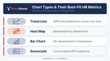
Step 3: Choose the Right Visualizations
Match chart types to the data:
- Trend lines for eNPS and satisfaction scores over time
- Heat maps for absenteeism by department
- Bar charts for DEI representation comparisons
- Scorecards for current-period KPI snapshots
A dashboard that requires a guided tour defeats its own purpose. If a chart needs a footnote to make sense, simplify it.
Step 4: Assign Ownership and Access Levels
Define who sees what — executives see org-wide aggregates, managers see team-level data, HR sees full granularity. Critically, individual-level data should never be identifiable, especially from survey or feedback inputs. Protecting that anonymity is what keeps employees willing to provide honest input in the first place.
Step 5: Establish a Review and Action Cadence
A dashboard no one acts on is an expensive screensaver. Build in:
- Monthly reviews for trend monitoring and early warning detection
- Quarterly deep analyses to assess whether initiatives are moving the metrics they were designed to address
- Real-time alerts for significant metric drops requiring immediate attention
- Named owners for each insight category, so follow-through doesn't fall through the cracks
Why Your EX Dashboard Data Might Be Misleading
Here's the uncomfortable reality: your dashboard only surfaces data employees are willing to share.
When employees fear that honest responses will lead to retaliation — even subtle retaliation like being passed over for assignments or receiving increased scrutiny — they self-censor. The result is a dashboard full of inflated satisfaction scores and suppressed warning signs. Leadership sees a false picture of cultural health and acts accordingly.
The Participation Problem
Low survey response rates don't just reduce sample size — they create selection bias. Culture Amp recommends 80–90% participation as a minimum benchmark for representative employee survey data.
In practice, most organizations fall well short of that. The employees who opt into surveys tend to be the most engaged ones. Disengaged, fearful, or disillusioned employees opt out entirely — which means the data systematically skews positive precisely when the real experience is deteriorating.

Psychological Safety Is a Data Prerequisite
Edmondson's foundational 1999 research defines team psychological safety as "a shared belief that the team is safe for interpersonal risk-taking." Google's Project Aristotle independently identified it as the single most important factor in team effectiveness.
The implication for EX dashboards is direct: if employees don't feel safe being honest, the data they generate is compromised before it ever reaches a chart.
Anonymous feedback collection is the most direct solution. AnonyMoose's platform is built on the principle that anonymity must be structural: submissions cannot be traced to individual users by either the employer or the platform itself. Features like Polls & Surveys, Openlines, and Hotlines give employees multiple channels for honest input, with a technical guarantee that their identity is never exposed.
The Downstream Consequence
Leaders who invest in culture programs, DEI initiatives, and management training based on skewed dashboard data are optimizing against a false baseline. The interventions address the perception problem, not the real one.
Clean, anonymous data leads to different decisions. That data surfaces friction points that polished survey scores never would:
- The manager whose team is consistently disengaged but not saying why
- The department with a structural inclusion problem others can't see
- The policy change that's been quietly eroding trust for months
Addressing those real problems reduces external venting on platforms like Glassdoor, decreases genuine voluntary turnover, and moves satisfaction scores in ways that reflect actual improvement rather than a measurement artifact.
Frequently Asked Questions
What is an employee experience insights dashboard?
An EX insights dashboard is a real-time data visualization tool that consolidates employee sentiment metrics, survey results, and workforce KPIs into a single interface. It allows HR leaders and managers to monitor satisfaction, engagement, and wellbeing trends and make informed decisions based on current data rather than delayed reports.
How is an employee experience dashboard different from an HR dashboard?
HR dashboards focus on operational and administrative metrics — headcount, payroll, compliance, benefits utilization. An EX insights dashboard focuses specifically on how employees feel and experience their workplace, covering sentiment, engagement, belonging, and culture alongside structural data.
What metrics should an employee experience dashboard include?
Core categories are sentiment metrics (eNPS, ESAT), behavioral metrics (absenteeism, voluntary turnover), and DEI indicators (representation, promotion equity, inclusion sentiment). The right mix depends on your organization's specific goals — start with the metrics that answer your most pressing workforce questions.
How do you ensure the data on an EX dashboard is accurate?
Accuracy depends on honest participation, which requires psychological safety. Tools that remove any technical possibility of individual identification — not just policy promises — produce significantly more representative data than traceable survey methods.
Who should have access to the employee experience dashboard?
Access should be tiered: executives see org-wide aggregate KPIs, managers see their team-specific metrics, and HR has full visibility across all dimensions. Individual employee data should always be protected — this is the foundation of employee trust in the feedback system.
How often should you review your employee experience dashboard?
Monthly reviews work well for trend monitoring, while quarterly analyses assess whether initiatives are moving the metrics they targeted. Also set real-time alerts for significant drops: a sudden eNPS decline or absenteeism spike in one department warrants faster attention than your next scheduled review.