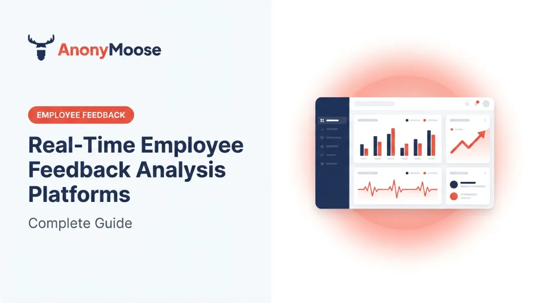
Introduction
Most organizations collect employee feedback. Far fewer do anything meaningful with it.
The problem isn't a lack of surveys — according to Perceptyx, 98% of organizations surveyed employees within the past year. The problem is what happens after. Data sits in disconnected tools, annual reports gather dust, and HR leaders make culture decisions based on last quarter's snapshot rather than living trend lines.
The cost of this gap is real. Gallup estimates voluntary turnover costs U.S. businesses $1 trillion annually, with replacing a single employee running anywhere from half to twice their annual salary. Most of that is preventable. Gallup found that 52% of voluntarily exiting employees said their manager or organization could have done something to keep them. Research from Axios HQ, based on LinkedIn studies, adds context to why that prevention so often fails: 42% of employees have left an organization due to poor internal communication — a root cause that only surfaces in a feedback dashboard when the underlying channels are trusted enough to capture it honestly.
An employee feedback trends dashboard changes this equation. It shifts HR from reactive to predictive — turning disconnected data points into patterns that surface problems before they escalate into turnover. This guide covers the key metrics, emerging trends, and action strategies that make that possible.
Key Takeaways
- A feedback trends dashboard combines eNPS, satisfaction scores, and turnover data into one time-series view that reveals patterns, not just snapshots.
- Tracking trends over time lets HR leaders spot disengagement early and measure whether workplace initiatives are actually working.
- Employees share more honestly when anonymity is built into the system architecture, not just promised in policy — making it foundational to dashboard accuracy. Research from buildempire.co.uk shows that genuinely anonymous surveys achieve 90% participation versus 30% for identified surveys and generate 58% more honest feedback — a difference that determines whether a feedback trends dashboard is measuring reality or what employees felt safe reporting.
- Closing the loop (acknowledging feedback, acting on it, communicating changes) is what separates dashboards that transform culture from those that merely report on it.
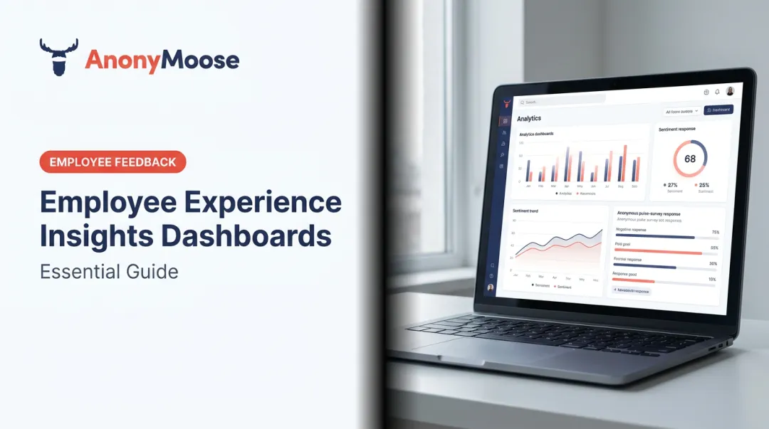
What Is an Employee Feedback Trends Dashboard?
An employee feedback trends dashboard is a centralized analytics tool that aggregates feedback signals — surveys, pulse checks, eNPS, sentiment scores — and displays how they change over time. Rather than a static report, it gives HR professionals and leaders a real-time view of workforce health.
The Key Differentiator: Longitudinal Tracking
A one-time survey report answers "what do employees think today?" A trends dashboard answers the more useful questions: Is sentiment improving or declining? Did that new management training actually move the needle? Which teams are showing early warning signs?
That time-based view turns raw feedback into a story — one HR teams can act on before small issues become costly ones.
Primary Users Across the Organization
| User | Primary Need |
|---|---|
| HR Managers | Monitor organizational health, track KPI impact |
| Team Leaders | Track morale at department level |
| Executives | Workforce planning, culture strategy |
Platforms like AnonyMoose are built around this model: consolidating Openlines, Polls & Surveys, Hotlines, and Broadcast data into a unified Insights Dashboard where leadership can view aggregated analytics and track trends over time, without ever accessing individual identities.
Key Metrics Every Employee Feedback Dashboard Should Track
Employee Net Promoter Score (eNPS)
eNPS is the most widely used engagement metric. It asks one question: How likely are you to recommend this organization as a place to work?
Respondents fall into three categories on an 11-point scale:
- Promoters (9–10): Enthusiastic advocates
- Passives (7–8): Satisfied but not committed
- Detractors (0–6): Disengaged or actively unhappy
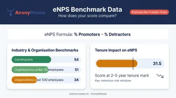
Calculation: eNPS = % Promoters − % Detractors
For context, BambooHR's 2025 data shows eNPS averages of 54 for construction, 51 for organizations under 25 employees, and 34 for organizations over 500 employees. Scores drop further with tenure — employees at the two-to-five-year mark average 31.5.
Culture Amp notes that eNPS captures only one dimension of engagement and is less reliable than multi-item measures. Treat it as a directional signal, not a definitive verdict.
Employee Satisfaction Score (ESAT)
ESAT measures overall contentment with the organization, typically on a 5-point Likert scale. The number itself matters less than the trend. A satisfaction score that drops two points over three quarters points to something real — a policy change, a management shift, or a benefits gap worth investigating.
BambooHR reported overall employee satisfaction rose 12% since 2024, with finance up 18% and technology up 11%, suggesting industry-level benchmarking is possible and worth tracking.
Turnover, Attrition, and Retention Rates
These three metrics are related but distinct:
- Total separations include all departures (voluntary, involuntary, retirements)
- Quits are strictly voluntary resignations — the most telling signal of culture problems
- Retention rate measures the percentage who stay over a given period
The BLS reported a 2025 annual average total separations rate of 3.3% across all industries, with leisure and hospitality running as high as 5.6%. These benchmarks offer useful context, though your own trend line will tell you more than any industry average will.
Absenteeism Rate
Unplanned absences are often an early warning signal of burnout, low morale, or toxic team dynamics. The BLS tracks this as the ratio of workers with absences to total full-time employment — their 2025 benchmark sits at 3.2% for full-time wage and salary workers.
As Gallup notes, poor wellbeing drives higher absenteeism alongside lower productivity and higher turnover. When absenteeism trends upward on your dashboard, treat it as a leading indicator of what's coming in your turnover data.
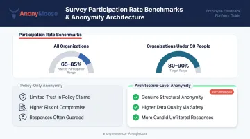
Anonymous Feedback Participation Rate
A dashboard is only as reliable as the data feeding it. Culture Amp benchmarks healthy employee survey response rates at 65–85%, with organizations under 50 people targeting 80–90%.
Low participation skews results. When employees fear identification, they self-censor or disengage from surveys entirely. Platforms that ensure genuine anonymity — where neither the platform nor the employer can technically identify individual respondents — generate more candid and representative data. AnonyMoose, for example, builds this guarantee into its architecture: there is no technical mechanism within the platform that can expose who submitted a response.
High participation rates, combined with specific and substantive open-text responses, are signals that the feedback channel is actually trusted.
Top Employee Feedback Trends Redefining the Modern Workplace
From Annual Surveys to Continuous Listening
The once-a-year engagement survey is giving way to pulse surveys, weekly check-ins, and always-on feedback channels. McKinsey defines continuous employee listening as using people analytics to capture employee sentiment in both the short and long term — turning a dashboard from an annual snapshot into a real-time instrument.
The cadence matters, though. Culture Amp found that 90% of companies surveying the same people weekly or monthly fail to maintain response rates above 50%. Quarterly pulse surveys tend to hit the sweet spot — frequent enough to catch trends, infrequent enough to avoid fatigue.
AnonyMoose supports this model through its Openlines feature (always-on, mobile-first channels where employees can initiate conversations with leadership at any time), alongside scheduled Polls & Surveys that can be deployed to the entire organization or targeted subgroups instantly.
Anonymous Channels as the Standard for Psychological Safety
Google's Project Aristotle identified psychological safety as the single most important dynamic in high-performing teams. Individuals on psychologically safe teams are less likely to leave, more likely to bring in revenue, and rated effective twice as often by executives.
Anonymous internal feedback channels are now a core mechanism for building that safety, not an optional add-on. When employees can report concerns, suggest ideas, or flag problems without fear of retaliation, the quality of dashboard data improves meaningfully.
Without trusted internal channels, frustrations migrate to external platforms. Glassdoor hosts reviews for over 2.3 million companies, all posted anonymously. Organizations that give employees a safe internal outlet (one that's genuinely anonymous by design) reduce the risk of sentiment appearing publicly where it damages recruiting and brand reputation.
AI-Powered Sentiment Analysis and Theme Detection
SHRM reported in 2024 that 1 in 4 organizations used AI for HR-related activities. In the feedback context, AI's most valuable application is turning open-text responses (often the richest source of insight) into quantifiable dashboard signals.
Rather than reading thousands of individual comments, AI tools surface recurring themes:
- Workload complaints and burnout signals
- Recognition and appreciation gaps
- Leadership effectiveness concerns
- Communication breakdowns across teams
These themes become trackable trend lines, not just qualitative noise.
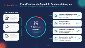
AnonyMoose's Insights Dashboard uses this approach for Hotlines data. AI analyzes patterns across all reported incidents to surface key themes, helping executives understand what employees are collectively experiencing without accessing individual identities.
DEI Metrics Becoming Core Dashboard Components
Inclusion, belonging, and equity are moving from aspirational values to formal dashboard metrics. Gallup found that 42% of U.S. employees say a diverse and inclusive organization is very important when considering a new job. McKinsey reported companies in the top quartile for gender diversity on executive teams were 39% more likely to financially outperform peers.
The practical implication: organizations need segmented feedback data to identify whether experience gaps exist across groups.
AnonyMoose's Close User Groups feature allows surveys to target precisely defined subgroups (by role, location, tenure, or custom criteria). Results are aggregated anonymously, so leaders can see whether certain groups report fundamentally different workplace experiences without compromising individual privacy.
Mobile-First Feedback Collection
Roughly 80% of the global workforce doesn't sit at a desk. Feedback tools designed for office-based employees with laptop access systematically exclude frontline, distributed, and deskless workers, skewing dashboard data before a single response is collected.
Mobile-first platforms address this by removing the access barrier entirely. AnonyMoose's SaaS model is built around this principle: push notifications reach every eligible employee's phone the moment a survey is published, whether they're in a warehouse, on a construction site, or operating remotely. A single tap submits a response.
How to Turn Dashboard Insights into Actionable Workplace Success
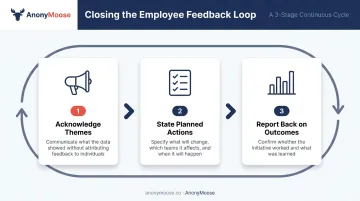
Close the Feedback Loop Visibly
The fastest way to destroy participation rates is to collect feedback and go silent. Employees who see their input disappear into a void stop providing honest responses — which corrupts future dashboard data.
Closing the loop means:
- Acknowledge themes — communicate what the data showed, without attributing to individuals
- State planned actions — be specific about what will change and when
- Report back on outcomes — tell employees whether the initiative worked
AnonyMoose's Broadcast feature supports this directly — leaders can target the exact employee groups who provided feedback on a given issue and deliver policy updates, leadership messages, or outcome summaries with guaranteed push notification delivery.
Segment Trends by Team, Department, or Role
Organization-wide averages mask serious localized problems. A department with a 40% eNPS drop won't register meaningfully when diluted into a company-wide score.
Segmented trend views let managers address problems at the source. When one team's satisfaction score declines while the organization's stays flat, that's a management or workload signal — not a culture-wide crisis. The fix is targeted, not blanket.
Set Internal Benchmarks
External benchmarks tell you where you stand. The more useful question is whether you're improving relative to your own baseline — six months ago, a year ago. Set improvement targets, define acceptable ranges for each metric, and flag anomalies automatically. When absenteeism jumps two percentage points in a single quarter, that should trigger investigation, not just note-taking.
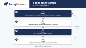
Build a Feedback-to-Action Workflow
Most organizations stop at insight. The step that actually changes outcomes is translating dashboard data into assigned ownership with clear deadlines.
When the dashboard surfaces a theme — say, recognition gaps in the engineering team — the workflow should look like this:
- Identify the pattern through trend data and sentiment analysis
- Assign ownership to a specific manager or HR lead
- Define the initiative and timeline
- Track whether the metric moves in response
AnonyMoose's Web interface supports case management for feedback conversations, including urgency levels, status updates, and activity history — giving HR teams a structured way to move from insight to action.
Common Challenges in Feedback Dashboard Management
Data Silos and Fragmented Sources
When feedback lives in separate tools — one for pulse surveys, another for performance reviews, another for incident reports — the dashboard loses its ability to reveal cross-cutting trends.
AnonyMoose addresses this by consolidating Openlines, Polls & Surveys, Hotlines, and Broadcast into a single platform with a unified Insights Dashboard. Employee data from any HRMS uploads via a simple Excel file, and all four feedback channels feed into the same analytics view.
Low Participation and Non-Representative Data
A dashboard built on a 30% response rate produces unreliable trend lines. Four factors drive meaningful participation:
- Communicate the purpose — employees need to understand why the feedback matters
- Guarantee anonymity — built into the technical architecture, not just stated as policy
- Keep surveys short — respect people's time
- Demonstrate impact — show employees that prior feedback led to visible change
Overreliance on Quantitative Metrics
Numbers tell leaders what is happening, but rarely why. A satisfaction score drop might signal workload issues, a management change, or a benefits rollback — the number alone doesn't distinguish between them.
Pairing quantitative metrics with sentiment analysis and open-text theme tracking reveals the context behind score changes. Without that context, initiatives target symptoms rather than causes — and the underlying problem persists.
Frequently Asked Questions
What are the 3 C's of feedback?
UNC Executive Development describes the 3 C's as Clarity, Contextual Meaning, and Composure — a framework for delivering feedback employees can understand and act on. Each element helps managers tailor conversations to individual needs rather than using a one-size-fits-all approach.
What are the 5 C's of employee retention?
Perceptyx identifies the 5 C's as Compensation, Career Development, Culture, Communication, and Connection. Together, these factors address why employees stay or leave, spanning both tangible rewards and the relational dimensions of work that build long-term loyalty.
What do the 12 Gallup questions measure?
The Gallup Q12 is a 12-question engagement survey designed to measure the conditions that predict engagement, productivity, and retention at the team level. Top-quartile teams on the Q12 show 23% higher profitability and 78% lower absenteeism than bottom-quartile teams.
What metrics should be on an employee feedback trends dashboard?
The core metrics are eNPS, ESAT (employee satisfaction score), total separations or turnover rate, absenteeism rate, and anonymous feedback participation rate. The best dashboards track all of these over time rather than as point-in-time readings — because a single data point rarely tells you whether things are improving or getting worse.
How does anonymous feedback improve dashboard data quality?
Anonymous feedback removes the fear of retaliation, which is the primary reason employees give socially acceptable responses instead of honest ones. When employees know their identity cannot be traced — technically, not just by policy — they share more candid, specific, and representative input, producing trend data that reflects actual sentiment.