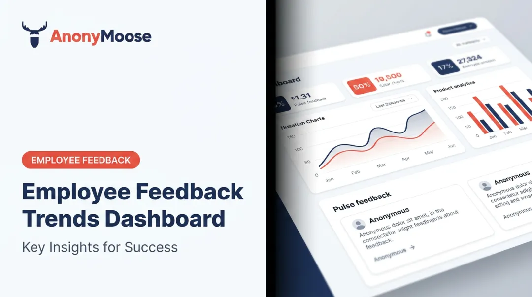
Introduction
HR teams are sitting on more workforce data than ever, yet most decisions still get made on gut instinct or patchwork spreadsheet exports. The disconnect is costly: Gallup estimates voluntary turnover costs U.S. businesses $1 trillion annually, and replacing a single employee can run anywhere from half to twice their annual salary.
Yet Deloitte found that only 9% of companies actually understand which talent dimensions drive performance, despite 71% calling people analytics a high priority.
The gap isn't a data shortage. It's a decision-readiness problem.
This guide covers what an HR analytics dashboard is, the four types of HR analytics, key dashboard examples, the metrics that matter most, best practices for building one that drives real decisions, and the employee voice layer that most dashboards are missing entirely.
Key Takeaways
- HR analytics dashboards centralize workforce data into one interactive view, replacing fragmented, siloed reports
- The four analytics types (descriptive, diagnostic, predictive, prescriptive) define what your dashboard can actually do
- High-impact dashboard types include headcount, turnover, recruitment, DEI, and engagement
- Choose metrics that tie directly to business goals — not just whatever data is easiest to pull
- Anonymous employee feedback is the missing data layer most dashboards lack
What Is an HR Analytics Dashboard?
An HR analytics dashboard is a business intelligence tool that aggregates and visualizes workforce data — headcount, turnover, engagement, compensation, recruitment — in a single interactive interface. It replaces the monthly spreadsheet export with a live view that decision-makers can act on immediately.
Static Reports vs. Dynamic Dashboards
The difference matters more than most HR teams realize:
| Feature | Static HR Report | HR Analytics Dashboard |
|---|---|---|
| Data freshness | Point-in-time snapshot | Real-time or near-real-time |
| Interactivity | Read-only | Drill-downs, filters, segmentation |
| Audience | Single recipient | Role-based access across levels |
| Decision support | Backward-looking | Forward-facing |
A static report tells you what turnover was last quarter. A dashboard shows which departments are trending upward right now, and lets you drill into tenure bands or job functions to find out why.
Broad vs. Role-Specific Dashboards
Once you understand what a dashboard can do, the next question is: who is it for? Dashboards can serve the whole organization or specific functions:
- Executive summary dashboards surface high-level KPIs for the C-suite
- Recruitment dashboards track pipeline health, time-to-fill, and source effectiveness
- DEI dashboards monitor representation by level, pay equity, and promotion rates
- HRBP dashboards cover team-level engagement, attrition risk, and headcount changes
Which type you build depends on who needs to make what decision — not on what's easiest to pull from your existing systems.
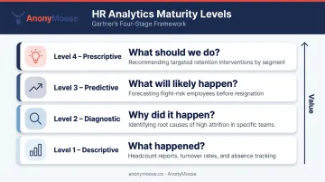
The 4 Types of HR Analytics
Gartner's analytics framework describes four levels, each answering a progressively more valuable question:
- Descriptive — What happened? Current headcount, past turnover rates, absenteeism trends. Most dashboards live here.
- Diagnostic — Why did it happen? Root cause analysis of attrition spikes, performance drops, or engagement declines.
- Predictive — What will likely happen? Flight-risk scoring, hiring demand forecasting, workforce gap modeling.
- Prescriptive — What should we do? Recommending specific retention interventions, compensation adjustments, or succession moves.
Where Most Organizations Actually Are
Most HR teams are stuck at level one. Deloitte found that 82% of surveyed companies were only beginning the journey toward effective people analytics as recently as 2022, and HR.com's 2025 State of People Analytics report showed only 23% of HR professionals rated their organizations very or extremely effective at extracting value from people data.
The gap is largely a data problem. Half of HR professionals name data integration — pulling from multiple HR and non-HR systems — as their single biggest analytics obstacle. You cannot build a diagnostic or predictive dashboard on fragmented, inconsistent data.
The implication: build a clean descriptive foundation first, then mature into diagnostic and predictive capabilities as data hygiene improves.
Key HR Analytics Dashboard Examples
Every organization's needs differ, but these five dashboard types deliver consistently high impact across industries.
Headcount and Workforce Demographics Dashboard
The foundational dashboard. It answers: Who works here, where, and in what capacity?
Key views include total headcount trended over time, broken down by department, location, employment type (full-time, part-time, contractor), age, gender, and tenure. Geographic visualization has become particularly important — not just for planning but for gauging exposure to regional disruptions like economic shifts and local labor shortages.
Organizations doing workforce planning had 7% higher talent outcomes, 5% higher HR outcomes, and 3% higher business outcomes than those that didn't, according to Sapient Insights.
Employee Turnover and Attrition Dashboard
This dashboard answers the expensive question: Which segments are most at risk of leaving?
It surfaces voluntary vs. involuntary turnover rates, segmented by business unit, tenure band, and job function. Industry benchmarks matter here — a 3% turnover rate looks very different in government vs. a restaurant chain. 2025 BLS data illustrates the spread:
- Private industry overall: 2.2% quits rate
- Leisure and hospitality: 3.9%
- Accommodation and food services: 4.2%
- Government: ~0.8% benchmark
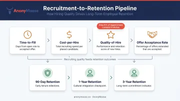
Talent Acquisition and Recruitment Dashboard
Tracks: time-to-fill, cost-per-hire, offer acceptance rate, source-of-hire effectiveness, and open requisitions by department.
Benchmark context:
- Average time-to-fill reached 59.67 days in 2025 (Greenhouse)
- SHRM's 2025 data puts average cost-per-hire at $5,475 for non-executive roles and $35,879 for executive roles
- Only 20% of organizations track quality-of-hire — the most important recruiting metric
Without this visibility, recruiting stays reactive. With it, hiring teams can manage pipelines proactively — before roles go critical.
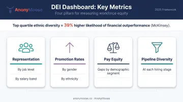
DEI Dashboard
A real DEI dashboard goes beyond headcount diversity. Key metrics include:
- Representation by job level and salary band
- Promotion and termination rates across gender and ethnicity
- Pay equity gaps by demographic segment
- Pipeline diversity at each hiring stage
Women held 29% of C-suite positions in 2024, up from 17% in 2015 — but women of color remain significantly underrepresented at senior levels.
McKinsey's Diversity Matters research found companies in the top quartile for ethnic diversity had a 39% higher likelihood of financial outperformance. Without disaggregated data at each job level, those inequities stay hidden — and unaddressed.
Employee Engagement and Performance Dashboard
Tracks engagement scores, performance rating distributions, training completion rates, and promotion timelines. Gallup's November 2024 data shows U.S. employee engagement at just 31%, with active disengagement at 17%.
Of all five dashboards, this one has the most direct line to culture and retention outcomes. It's also where data quality risk is highest — a point we'll return to later.
What Should an HR Dashboard Include?
Metric selection should be driven by business goals, not by what's easiest to pull from existing systems. Here's a practical framework across three core areas.
Workforce Management KPIs
| Metric | Why It Matters |
|---|---|
| Absenteeism rate | BLS puts the overall employed absence rate at 3.2% in 2025; deviations signal team health issues |
| Promotion rate | ADP found managerial promotion rates cooled to 6.5% in 2024 |
| Internal mobility rate | LinkedIn data shows this rose from 18.7% in 2021 to 24.4% in 2023 |
| Succession planning coverage | Gartner reports 72% of HR leaders struggle to close successor capability gaps |
| Manager-to-employee span of control | McKinsey archetypes range from 3-5 (player/coach) to 15+ (coordinator) |
| Tenure distribution | Reveals flight risk concentration in specific cohorts |
Compensation and Benefits KPIs
- Labor cost per FTE — BLS puts employer compensation costs at $48.78/hour for civilian workers (December 2025)
- Compensation equity ratios — Women's full-time earnings were 83% of men's in 2024 (BLS)
- Pay-band distribution by job level — Reveals compression and outlier issues
- Total benefits as % of labor costs — Critical for budget and ESG reporting
Under ESRS S1, organizations must now disclose headcount breakdowns by gender and the gender pay gap — making compensation dashboards a compliance requirement, not just an analytical convenience.
Recruitment and Retention KPIs
Compliance obligations addressed, the next pressure point is the hiring funnel itself. Track these metrics together to determine whether recruiting efforts are solving the retention problem — or just backfilling a leaky pipeline:
- Time-to-fill and cost-per-hire (benchmarked against SHRM/Greenhouse data)
- Quality-of-hire (currently tracked by only 20% of organizations)
- Voluntary turnover rate by tenure cohort
- Retention rate at 90 days, 1 year, and 3 years
- Recruiting expense per new hire
A note on data hygiene: Every metric is only as reliable as the underlying data. A unified HRIS/HCM as the single source of truth is a prerequisite. Inconsistent definitions across systems — what counts as "voluntary" vs. "involuntary" turnover, for instance — will undermine any visualization effort before it starts.
Best Practices for Building an Effective HR Dashboard
Start with a Clear Use Case and Audience
The most common dashboard failure mode: building before defining who will use it and what decision it needs to support. A CHRO needs a high-level summary view; an HRBP needs drill-down capability into their specific business unit. These are different products, even if they pull from the same data.
Before touching any BI tool, answer:
- Who is the primary user?
- What decision does this dashboard need to support?
- What action should a user be able to take after viewing it?
Choose the Right Visualization for Each Metric
Not all HR data should look the same:
- Trend lines — turnover over time, headcount growth
- Stacked bar charts — demographic breakdowns by department or level
- Heat maps — geographic workforce distribution
- Highlight tables — compensation equity comparisons across bands
- Waterfall charts — net headcount changes (hires minus terminations)
Poor visualization choices don't just look bad — they obscure insights rather than surface them.
Build in Data Definitions and Transparency
Include inline glossaries or footnotes explaining how each metric is calculated. What counts as "voluntary" turnover? Is a fixed-term contractor included in headcount? When stakeholders draw conflicting conclusions from the same dashboard, it's usually a definitions problem, not a data problem.
Clear definitions build stakeholder trust in the data — and that trust is what actually enables people to act on what they see.
Review and Iterate Regularly
Dashboards are not launch-and-forget products. Sapient Insights found that organizations updating their HR systems strategies every 12–18 months were twice as likely to inform business strategy with HR data. Schedule quarterly reviews to keep dashboards aligned with shifting priorities:
- Assess whether tracked metrics still reflect current business goals
- Retire widgets that no longer get used
- Add new data sources as HR strategy evolves
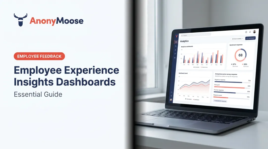
The Missing Layer: Employee Voice in HR Analytics
Operational metrics tell you what is happening. They rarely tell you why.
An engagement score that drops from 74% to 62% is visible in the dashboard. The reason — whether it's a specific manager's behavior, a policy change, or a compensation equity concern — usually isn't. And when employees don't feel psychologically safe, they withhold honest feedback, skewing survey results and leaving root causes invisible in the data.
Visier's 2024 research found that 47% of employees feel pressured to withhold feedback in engagement surveys, with 37% citing doubts about whether surveys are truly anonymous as the primary reason for less-than-honest responses.
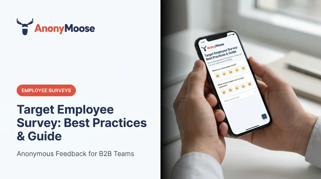
How Anonymous Feedback Fills the Gap
This is the data layer most HR analytics dashboards are missing. Anonymous employee feedback tools serve as a dedicated real-time input stream — capturing candid signals on culture, DEI concerns, managerial issues, and safety risks that structured HRIS data cannot reach.
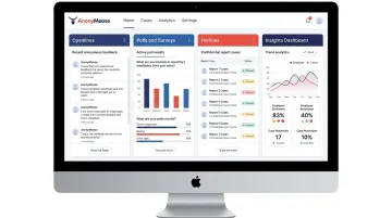
AnonyMoose is built precisely for this use case. The platform gives HR leaders four active listening channels:
- Openlines — always-available anonymous two-way channels between employees and specific leaders or departments, managed as structured cases with urgency and status tracking
- Polls & Surveys — real-time pulse surveys delivered via push notification, targeting defined subgroups with results aggregated anonymously in the Insights Dashboard
- Hotlines — anonymous incident reporting for harassment, discrimination, and ethics breaches, with AI-powered pattern analysis to surface themes across cases
- Insights Dashboard — the central hub aggregating all feedback data, tracking trends over time so HR leaders can act on candid, fear-free input
Combining Operational and Voice Data
Operational HR data shows that engagement dropped 12%. Anonymous voice data — from pulse surveys and Hotline patterns — surfaces the cultural or managerial factors behind that drop. Together, they shift HR from diagnosing a number to solving an actual problem.
Frequently Asked Questions
What is an HR analytics dashboard?
An HR analytics dashboard is a visual business intelligence tool that collects and displays key workforce metrics — headcount, turnover, recruitment, engagement, compensation — in a centralized, interactive interface. It replaces static reports with real-time data that supports HR and business decision-making at every level.
What should an HR dashboard include?
At minimum: workforce management KPIs (headcount, turnover, absenteeism), compensation KPIs (labor cost per FTE, pay equity ratios), and recruitment KPIs (time-to-fill, quality-of-hire, retention by cohort). Engagement scores and DEI metrics round out a comprehensive view.
What are the 4 types of HR analytics?
Descriptive (what happened), diagnostic (why it happened), predictive (what will likely happen), and prescriptive (what action to take). Most organizations start with descriptive analytics and build toward predictive and prescriptive as their data maturity grows.
What are the 4 types of HR dashboards?
Operational dashboards (day-to-day HR metrics), strategic dashboards (long-term workforce planning), analytical dashboards (deep-dive data exploration), and tactical dashboards (specific initiatives like DEI or recruitment campaigns). Most organizations need more than one type.
How often should HR dashboards be updated?
Operational metrics like open requisitions and absenteeism benefit from daily or real-time refresh. Strategic dashboards are typically reviewed monthly or quarterly. The cadence should match the decision-making cycle the dashboard is designed to support.
What is the difference between HR reporting and HR analytics?
HR reporting delivers a historical snapshot: last quarter's turnover rate, for example. HR analytics goes further — interpreting that data to identify patterns, diagnose causes, and guide forward-looking decisions. Dashboards bridge both functions in one interface.